Are you tired of making decisions based on mountains of data that leave you feeling overwhelmed and uncertain? Imagine having the power to transform complex data into insightful visuals that guide you towards smarter choices with confidence. Interactive data dashboards offer this transformative capability, revolutionizing the decision-making process for executives and business owners alike.
In a world inundated with information, mastering the art of data visualization is no longer a luxury but a necessity. These dashboards provide a real-time window into your data universe, offering a dynamic way to interpret and act upon crucial information efficiently. Let’s delve into the realm of interactive data visualization and discover how these innovative tools can elevate your decision-making prowess to new heights.
This blog will unveil the magic behind interactive data dashboards, exploring their role in enhancing decision-making, showcasing successful examples, and providing practical tips to create impactful dashboards. Get ready to unlock the potential of data visualization and embark on a journey towards making smarter, data-driven decisions that propel your business forward.
Introduction to Interactive Data Dashboards
In today’s data-driven world, making informed decisions is crucial for businesses to stay competitive. However, the abundance of complex data can often pose challenges in understanding and extracting valuable insights. This is where data visualization comes into play. By representing data in visual formats, it becomes easier to grasp patterns, trends, and relationships, resulting in smarter decision-making.
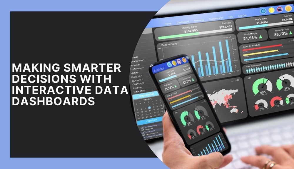
At the forefront of data visualization tools are interactive data dashboards. These dashboards provide a dynamic and user-friendly interface for exploring and analyzing data in real-time. Interactive data dashboards allow users to customize and filter the displayed information, making it possible to focus on specific data points or drill down into details effortlessly.
The concept of interactive data dashboards revolves around providing a visual representation of complex datasets, allowing decision-makers to quickly absorb and comprehend a vast amount of information. With interactive elements such as charts, graphs, and maps, users can interact with the data, uncovering insights that might not be apparent in static reports.
Interactive data dashboards offer numerous benefits for decision-making. They empower users to explore data from different angles and perspectives, fostering a deeper understanding of the underlying patterns and trends. This enables decision-makers to identify actionable insights and make data-driven decisions that lead to better outcomes.
In the following sections, we will delve deeper into the world of interactive data dashboards, exploring their role in decision-making, types of data visualization tools available, best practices for creating impactful dashboards, and even real-world case studies that demonstrate their effectiveness. So let’s dive in and discover the power of interactive data dashboards in revolutionizing your decision-making process.
Understanding Data Visualization
Data visualization is a powerful technique that involves representing complex information visually through charts, graphs, and interactive visualizations. It plays a crucial role in helping individuals and organizations make sense of vast amounts of data and derive meaningful insights. Here are the key benefits of data visualization in decision-making:
1. Enhanced comprehension: Visualizing data allows us to see patterns, trends, and relationships that may not be apparent in raw data. By presenting information in a graphical format, data visualization enables us to understand complex concepts more easily and quickly.
2. Improved decision-making: Visual representations make it easier to analyze data and draw insights, leading to informed decision-making. Whether it’s identifying sales trends, monitoring key performance indicators, or understanding customer behavior, data visualization helps us make more accurate and timely decisions.
3. Enhanced communication: Data visualization enables effective communication of insights to stakeholders at all levels. Visual representations provide a common understanding of data, making it easier to convey complex ideas and support persuasive arguments.
4. Identifying outliers and anomalies: Visualizing data can help identify outliers and anomalies that may signify problems or opportunities. By visually examining data points, trends, and distributions, we can quickly spot deviations from the norm and take appropriate action.
5. Uncovering hidden insights: Data visualization can uncover hidden insights that may not be evident in traditional data analysis methods. Visual representations allow us to explore data from different angles, enabling the discovery of new connections and patterns.
6. Facilitating collaboration: By using interactive data visualization tools, teams can collaborate and explore data together. Dashboards and visualizations provide a shared understanding, fostering collaboration and promoting a data-driven culture within organizations.
In conclusion, data visualization is an essential component of the decision-making process. It enables us to analyze, interpret, and communicate complex information effectively. By harnessing the power of data visualization, individuals and organizations can unlock valuable insights and make informed decisions to drive success.
The Role of Real-Time Dashboards

Real-time dashboards play a crucial role in data visualization and decision-making processes. By providing up-to-the-minute insights into key metrics and data points, these interactive tools empower businesses to make informed and proactive decisions. Here, we will delve into the significance of real-time dashboards and how they enhance the data visualization experience.
Real-time Insights for Timely Decision-Making
Real-time dashboards offer a dynamic and responsive way to monitor and analyze data in real-time. Instead of relying on static reports and outdated information, decision-makers can access live updates and gain immediate visibility into their business operations. This enables them to respond swiftly to changes, identify emerging trends, and address potential issues promptly.
Visualizing Complex Data in an Interactive Manner
One of the key benefits of real-time dashboards is their ability to visualize complex data sets in a user-friendly and interactive manner. These dashboards use visual elements such as charts, graphs, and gauges to present data in a way that is easy to understand and digest. Through visual representations, decision-makers can quickly identify patterns, correlations, and outliers, helping them derive valuable insights and make data-driven decisions.
Empowering Collaboration and Effective Communication
Real-time dashboards also facilitate collaboration among team members by providing a centralized platform for data sharing and analysis. With everyone accessing the same up-to-date information, teams can align their efforts, discuss findings, and collectively work towards achieving common goals. Additionally, real-time dashboards simplify the communication of complex data by presenting it in a visual and intuitive format, enabling stakeholders at all levels to grasp the information easily.
Optimizing Performance and Driving Business Growth
By closely monitoring key performance indicators (KPIs) in real-time, real-time dashboards enable businesses to track their progress and identify areas for improvement. With a clear understanding of their performance metrics, decision-makers can implement targeted strategies, refine processes, and optimize operations to drive overall business growth. Real-time dashboards ensure that business goals are continuously monitored and aligned with data-backed insights.
In conclusion, real-time dashboards are indispensable tools for data visualization and decision-making. Their ability to provide real-time insights, visualize complex data, empower collaboration, and optimize performance makes them essential for businesses seeking to gain a competitive edge. By leveraging these interactive dashboards, organizations can stay proactive, make smarter decisions, and drive sustainable growth.
Types of Data Visualization Tools
When it comes to data visualization, there are numerous tools available in the market that cater to different needs and preferences. Whether you’re a beginner or an experienced data practitioner, these tools can help you transform complex data into meaningful insights. Here are some popular data visualization tools worth considering:
1. Tableau
Tableau is a widely-used data visualization tool that offers a user-friendly interface and a wide range of features. It allows users to create interactive dashboards, charts, and graphs, and supports a variety of data sources.
2. Power BI
Power BI, developed by Microsoft, is another popular choice for data visualization. With its drag-and-drop interface, users can easily create visually appealing reports and interactive dashboards. It also integrates well with other Microsoft products.
3. Google Data Studio
Google Data Studio is a free tool that enables users to visualize data from various sources such as Google Analytics, Google Sheets, and more. It offers a range of visualization options and allows for easy sharing and collaboration.
4. D3.js
D3.js is a powerful JavaScript library that provides a wide range of data visualization capabilities. It offers extensive customization options and allows for the creation of highly interactive and dynamic visualizations.
5. QlikView
QlikView is a business intelligence and data visualization tool that offers a unique associative data model. It allows users to explore and analyze data from multiple perspectives, making it ideal for complex data analysis.
6. Excel
Excel, a widely-used spreadsheet program, also offers basic data visualization capabilities. It may not be as advanced as dedicated data visualization tools, but it can still be useful for simple visualizations and analysis.
These are just a few examples of the many data visualization tools available in the market. When choosing a tool, consider factors such as ease of use, integration capabilities, customization options, and your specific data visualization requirements. With the right tool in hand, you can effectively communicate insights and make data-driven decisions.
Importance of Customization and Interactivity
Customization and interactivity play a crucial role in the effectiveness of data dashboards for better decision-making. Let’s explore why these aspects are so important:
Tailoring to Specific Needs
Customization allows users to tailor their data dashboards to their specific needs and preferences. By selecting the relevant metrics, visual elements, and layout, decision-makers can focus on the key information that matters most to them. Whether it’s sales figures, key performance indicators, or customer data, customization ensures that the dashboard provides actionable insights that align with specific business goals and questions.
Enhancing User Engagement
Interactivity in data dashboards encourages user engagement and active participation. Users can manipulate the data, apply filters, and drill down into specific data points to gain a deeper understanding of trends and patterns. This hands-on approach fosters a more meaningful connection with the data and helps users uncover valuable insights that can drive informed decision-making.
Promoting Collaboration and Communication
Interactive data dashboards enable effective communication and collaboration among team members. With real-time updates and shared access, stakeholders can work together, analyze data collectively, and discuss different angles and perspectives. This collaborative environment fosters a data-driven decision-making culture and ensures that everyone has access to accurate and up-to-date information.
Empowering Decision-Makers
Customization and interactivity empower decision-makers to explore different scenarios and evaluate the potential impact of alternative actions. By adjusting visualizations, applying filters, and testing various assumptions, users can evaluate the potential outcome of their decisions before taking the next step. This iterative process allows for a more thorough evaluation and increases the likelihood of making better-informed decisions.
In summary, customization and interactivity are essential components of effective data dashboards. By tailoring the dashboard to specific needs, promoting engagement and collaboration, and empowering decision-makers, organizations can maximize the potential of data visualization for better outcomes.
Best Practices for Creating Interactive Data Dashboards
Creating effective and impactful interactive data dashboards requires careful planning and consideration. By following best practices, you can ensure that your dashboards provide valuable insights and aid in making informed decisions. Here are some tips and guidelines to keep in mind:
Define Your Objectives and Audience
Before diving into dashboard design, clearly define your objectives. Identify the key metrics and data that will help you achieve your goals. Consider your audience and their specific needs. Are you creating a dashboard for executives, team members, or clients? Understanding your objectives and audience will guide the design and layout of your dashboard.
Keep it Simple and Intuitive
When designing your dashboard, simplicity is key. Avoid cluttering the screen with too much information. Focus on displaying the most important data points and metrics. Use clear and concise labels. Keep the layout intuitive, allowing users to easily navigate and comprehend the information at a glance.
Utilize Visual Hierarchy and Consistency
Visual hierarchy is crucial in guiding users’ attention to the most important elements of your dashboard. Use size, color, and placement to emphasize key metrics. Consistency is equally important. Keep the design elements consistent throughout the dashboard to create a cohesive and seamless user experience.
Ensure Data Accuracy and Timeliness
To maintain trust and credibility, it is crucial to ensure the accuracy and timeliness of the data displayed on your dashboard. Establish data validation processes to identify and correct any discrepancies. Implement real-time data integration to provide up-to-date information. Regularly review and validate data sources to ensure the integrity of your dashboard.
Provide Customization Options
Allow users to customize their dashboard based on their preferences and specific needs. Provide options for selecting different metrics, time frames, and visual representations. Customization empowers users to focus on the information that is most relevant to them, enhancing their decision-making process.
Test and Iterate
Regularly test and gather feedback on your interactive data dashboards. Conduct user testing to identify any usability issues or areas for improvement. Continuously iterate and refine your dashboard based on user feedback and evolving business requirements.
Remember, the goal of an interactive data dashboard is to provide actionable insights and facilitate informed decision-making. By following these best practices, you can create dashboards that are effective, intuitive, and valuable for your audience.
Challenges and Considerations
Implementing interactive data dashboards can bring numerous benefits to businesses and decision-making processes. However, like any new technology or tool, there are challenges that organizations may face during the implementation and adoption of interactive data dashboards. In this section, we will discuss some of these challenges and provide insights on how to overcome them.
1. Data Integration and Data Quality
One of the common challenges in implementing interactive data dashboards is ensuring proper data integration from various sources. Organizations often have data spread across multiple systems and databases, which need to be seamlessly integrated into the dashboard. Additionally, ensuring the accuracy and quality of data is crucial for making informed decisions. To overcome these challenges, organizations should invest in data integration solutions that can efficiently consolidate and transform data from various sources into a unified format. Implementing data governance practices and data cleansing techniques can also help improve data quality.
2. User Adoption and Training
Introducing interactive data dashboards to an organization requires user adoption and training. Employees may resist using the new tool if they are unfamiliar with its functionality or see it as an additional burden on their existing workload. To address this challenge, organizations should provide comprehensive training programs that enable employees to understand the benefits of interactive data dashboards and how to leverage them effectively. Encouraging a culture of data-driven decision-making and celebrating successful dashboard implementations can also drive user adoption.
3. Designing User-Friendly Dashboards
Designing user-friendly dashboards is crucial for their success. Complex layouts, cluttered visuals, and overwhelming amounts of information can hinder user engagement and make it difficult to derive actionable insights. When designing interactive data dashboards, organizations should focus on simplicity, clarity, and intuitive navigation. Using visual elements such as charts, graphs, and color coding can make the dashboards more engaging and easier to comprehend. Regular feedback from users and iterative improvements can help refine the design over time.
4. Security and Data Privacy
The security and privacy of sensitive data should always be a priority when implementing interactive data dashboards. Organizations must protect data against unauthorized access, data breaches, and ensure compliance with data privacy regulations. Implementing robust security measures, such as access controls, encryption, and monitoring solutions, can help mitigate these risks. Regular audits and assessments should be conducted to identify and address any vulnerabilities in the dashboard infrastructure.
Addressing these challenges and considering the associated considerations can greatly enhance the successful implementation and usage of interactive data dashboards within organizations. By doing so, businesses can unlock the full potential of their data and make better-informed decisions to drive growth and success.
Future Trends in Data Visualization

As the world becomes increasingly data-driven, the field of data visualization continues to evolve. Emerging trends in data visualization are shaping the way we perceive and interact with complex information. Two key trends to watch out for are AI analytics and real-time insights.
AI Analytics
Artificial Intelligence (AI) is revolutionizing the data analytics landscape by automating processes and uncovering meaningful patterns in large datasets. AI-powered data visualization tools can analyze vast amounts of data in real-time, enabling businesses to extract actionable insights quickly. AI algorithms can identify hidden trends, outliers, and correlations that human analysts might overlook. By harnessing the power of AI analytics, businesses can gain a competitive edge by making data-driven decisions faster and more accurately.
Real-Time Insights
Real-time data visualization allows businesses to monitor and respond to changing conditions in real-time. With the advent of powerful data streaming technologies, organizations can now visualize live data as it is generated, enabling them to identify trends and patterns as they unfold. Real-time dashboards provide an up-to-the-minute overview of key metrics, allowing decision-makers to make timely and informed decisions. This trend is particularly valuable for industries that require real-time monitoring, such as finance, logistics, and social media analytics.
In conclusion, the future of data visualization lies in embracing AI analytics and leveraging real-time insights. These emerging trends have the potential to revolutionize the way businesses analyze and interpret data, ultimately leading to more informed decision-making and better outcomes. Stay ahead of the curve by embracing these advancements and exploring the possibilities they offer for your organization.
Conclusion
In conclusion, interactive data dashboards are powerful tools that revolutionize the decision-making process. By visualizing complex data in a clear and engaging manner, these dashboards enable users to make informed and data-driven decisions. Through this article, we have explored the benefits of data visualization and the significance of real-time dashboards in enhancing decision-making. We have also provided examples of successful interactive data dashboards and discussed best practices for creating impactful dashboards.
Interactive data dashboards offer customization and interactivity, allowing users to explore specific data points and gain actionable insights. They not only facilitate effective communication within teams but also empower business users to make better decisions based on real-time data. With emerging trends in data visualization, such as AI analytics and real-time insights, it is an exciting time to leverage these tools for more accurate and strategic decision-making.
In summary, interactive data dashboards can transform the way organizations approach decision-making, leading to better outcomes and increased efficiency. By harnessing the power of visualization and interactivity, businesses can unlock the full potential of their data and gain a competitive edge in today’s data-driven world.