
In today’s digital landscape, responsive web design plays a crucial role in providing a seamless user experience across devices. Gone are the days when accessing websites was limited to desktop computers. With the proliferation of smartphones, tablets, and other mobile devices, users expect websites to adapt effortlessly to their screens, delivering a user-friendly experience regardless of the device they use.
Responsive web design ensures that a website’s layout and content automatically adjust to fit the screen size and resolution of different devices. By embracing this approach, businesses and website owners can tap into a wide range of benefits. Firstly, a responsive website improves user experience by eliminating the need for users to constantly zoom in and out or scroll horizontally to view content. This convenience leads to higher engagement and longer session duration, ultimately boosting user satisfaction.
Moreover, a responsive web design enhances search engine optimization (SEO) efforts. Google’s mobile-first indexing prioritizes mobile-friendly websites in search results, making a responsive design a ranking factor. Today, a significant number of internet users access websites through their mobile devices, and having a responsive design becomes essential to reach and engage this growing audience.
Additionally, a responsive website saves time and resources by eliminating the need to manage separate mobile and desktop versions. With a single website that adapts to various devices, web designers can streamline their processes and focus on creating consistent and optimized experiences for all users.
In conclusion, responsive web design is not just a trend but a necessity in the present digital era. By ensuring a website’s adaptability to different screen sizes and devices, businesses can deliver outstanding user experiences, improve SEO performance, and save time and resources in the long run. In the following sections, we will explore the best practices and techniques to achieve seamless user experiences through responsive web design.
What is Responsive Web Design?
Responsive web design & web development is a design approach that enables websites to adapt and respond to different screen sizes and devices. With the increasing use of mobile devices and the wide range of screen sizes available today, responsive web design has become crucial for providing a seamless user experience.
At its core, responsive web design uses techniques like fluid grids, flexible images and media, and media queries to dynamically adjust the layout and content of a website based on the user’s device. This ensures that the website looks and functions well across various devices, whether it’s a desktop computer, a tablet, or a mobile phone.
One of the key principles of responsive web design is the mobile-first approach, which involves designing and prioritizing the content for smaller screens first. This approach recognizes the growing number of mobile users and focuses on delivering a user-friendly experience on mobile devices.
By implementing responsive web design, websites can not only reach a wider audience but also improve their search engine optimization (SEO) as search engines like Google prioritize mobile-friendly websites. Additionally, responsive design simplifies maintenance by allowing a single website to adapt to different devices, rather than creating separate sites for each.
In summary, responsive web design is essential in today’s digital era to ensure that websites are accessible and user-friendly across a wide range of devices. It allows websites to adapt, provide a consistent experience, and meet the expectations of users accessing the site from various devices.
Fluid Grids
Fluid grids are a fundamental element of responsive web design. They allow content to dynamically resize and reposition based on the screen size it is viewed on. By using relative units like percentages instead of fixed pixel values, fluid grids enable websites to adapt seamlessly to different devices.
The concept behind fluid grids is to divide the layout into a flexible grid system. Each element within the grid is assigned a relative width, allowing it to proportionally adjust its size when the screen size changes. This means that no matter the device, the content will be displayed in a visually pleasing and user-friendly manner.
One of the key advantages of fluid grids is their ability to accommodate a wide range of screen sizes, from desktops to smartphones. This ensures that the website maintains its integrity and provides an optimal user experience across various devices.
Additionally, fluid grids contribute to improved accessibility and readability. Content can effortlessly adjust its layout, making it easier to read and interact with on smaller screens. This flexibility eliminates the need for excessive scrolling or zooming, enhancing user satisfaction and engagement.
Overall, fluid grids are an essential component of responsive web design as they allow websites to dynamically adapt to different screen sizes. By leveraging this technique, web designers can create user-friendly and visually appealing websites that seamlessly cater to the needs of their audience.
Flexible Images and Media
One of the key aspects of responsive web design is ensuring that images and media elements scale properly across devices. Optimizing images and media not only improves the overall user experience but also contributes to faster page load times. Here are some techniques to achieve flexibility in images and media for responsive websites:
1. Use Responsive Images
Implement responsive images that scale based on the user’s device screen size. This ensures that images display correctly and don’t appear distorted or too large on smaller screens. By using HTML’s `srcset` attribute and `sizes` attribute, you can serve different versions of the image based on the device’s pixel density and viewport size.
2. Optimize Image File Sizes
Compress and optimize image file sizes to reduce the page load time. Use image editing tools or online image compression services to reduce file sizes without compromising on quality. Additionally, consider utilizing modern image formats like WebP or JPEG 2000 that offer better compression and quality options.
3. Lazy Loading
Implement lazy loading for images and media elements. This technique delays the loading of non-visible images until the user scrolls down the page, improving the initial page load time. There are various JavaScript libraries available that can help easily integrate lazy loading functionality into your website.
4. CSS Techniques
Use CSS techniques to control the size and positioning of images and media elements. CSS properties like `max-width: 100%` and `height: auto` can ensure that images scale proportionally across different screen sizes. Additionally, CSS media queries can be used to customize styles, such as adjusting margins or padding, based on specific screen dimensions.
Remember, optimizing images and media plays a crucial role in delivering an optimal user experience on various devices. By implementing these techniques, you can ensure that your website’s visual content adapts seamlessly across different screen sizes, improving engagement and satisfaction for your users.
Media Queries
Media queries are a fundamental component of responsive web design as they play a crucial role in enabling CSS rules to be applied based on device characteristics. By utilizing media queries, web designers can create websites that adapt seamlessly across various screen sizes and devices.
How Media Queries Work
Media queries allow the presentation of a web page to be adjusted based on the user’s device or screen dimensions. CSS rules specified within these queries are activated only when certain conditions are met. For example, specific styles can be applied to target devices with a maximum width of 768 pixels or hide certain elements on smaller screens.
Creating Responsive Layouts
With media queries, designers can create different styles and layouts for different screen sizes. They can define breakpoints, which are specific screen widths at which the layout needs to adapt. By applying CSS rules within media queries, such as adjusting font sizes, repositioning elements, or even changing the entire layout, the website can gracefully respond to different devices and provide an optimal user experience.
Optimizing for Different Devices
Media queries also enable designers to optimize content specifically for different devices. For example, they can choose to display larger images on larger screens to maintain image clarity and detail. By tailoring the media and content to the user’s device, websites can deliver an enhanced and personalized browsing experience.
Conclusion
Media queries are an essential aspect of responsive web design, empowering designers to create flexible and adaptive websites. By utilizing media queries effectively, web designers can ensure that their websites look and perform optimally across a diverse range of devices.
Mobile-First Approach
In responsive web design, adopting a mobile-first approach has become increasingly important in ensuring a seamless user experience across devices. This approach involves prioritizing the design and functionality of a website for mobile devices, such as smartphones and tablets, before considering larger screens like desktop computers.
Benefits of a Mobile-First Approach
1. Enhanced User Experience: With the exponential growth of mobile users, optimizing the user experience for smaller screens has become paramount. By focusing on mobile design first, you ensure that the most critical information and functionality are easily accessible, providing a user-friendly experience for your mobile audience.
2. Better Performance: A mobile-first design encourages a more streamlined and efficient approach to website development. By prioritizing content and minimizing unnecessary elements, you can improve page load times, especially on slower connections, leading to a better overall performance across all devices.
3. Improved SEO: Adopting a mobile-first approach aligns with Google’s mobile-first indexing, where the search engine primarily uses the mobile version of a website for ranking and indexing. A mobile-friendly website is more likely to rank higher in search engine results, thus attracting more organic traffic.
4. Consistent Design: By initially focusing on the mobile interface, you establish a solid foundation for responsive design that can be easily adapted to larger screens. This consistency in design across devices helps create a cohesive brand experience and reduces the need for separate mobile and desktop versions of your website.
Prioritizing Content for Smaller Screens
When implementing a mobile-first approach, it’s crucial to prioritize content and navigation for smaller screens. This involves understanding the specific needs of mobile users and presenting the most important information upfront to ensure a seamless browsing experience. Techniques such as progressive disclosure – revealing additional content as needed – can be employed to optimize limited screen space while maintaining a user-friendly interface.
In conclusion, a mobile-first approach in responsive web design offers numerous benefits, including enhanced user experience, improved performance, better SEO rankings, and consistent design. By prioritizing content for smaller screens, you can create a website that seamlessly adapts to various devices and meets the needs of your mobile audience.
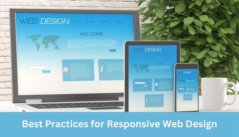
Best Practices for Responsive Web Design
Responsive web design is essential for creating seamless user experiences across devices. By following these best practices, you can ensure that your website adapts and performs well on various screen sizes and devices.
Define Your Goals and Target Audience
Before you start designing your responsive website, it’s crucial to define your goals and identify your target audience. Understanding the purpose of your website and the needs of your audience will help you make informed design decisions.
Choose a Mobile-First Approach
Adopting a mobile-first approach in responsive web design prioritizes the design for smaller screens, ensuring a user-friendly experience on mobile devices. With the increasing number of mobile users, designing for mobile first is a powerful strategy.
Select a Responsive Framework or Design Tool
To streamline the development process, consider using a responsive framework or design tool. These tools provide pre-built components and responsive layouts, saving you time and effort in creating a responsive design from scratch.
Create a Flexible Grid System
A flexible grid system is the foundation of responsive web design. It allows your website layout to adapt to different screen sizes by using relative units instead of fixed ones. This enables your content to resize and reposition seamlessly.
Implement Media Queries
Media queries play a significant role in responsive web design. They allow you to apply specific styles and CSS rules based on different device characteristics, such as screen size, orientation, and resolution. Utilize media queries to create device-specific layouts and ensure a consistent experience.
Prioritize Content and Navigation
In responsive web design, prioritizing content and navigation is crucial. Place the most critical information and important navigation elements prominently, especially on smaller screens, to enhance the user experience.
Optimize Images and Media
Optimizing images and media is essential for improving page load times on different devices. Use responsive image techniques, such as using the appropriate image format, compressing images, and lazy loading, to ensure optimal performance.
Test Across Devices and Browsers
Testing is essential to ensure that your responsive design works well on a wide range of devices and browsers. Test your website on different phones, tablets, and desktop screens to identify any issues and make necessary adjustments.
Monitor Performance
Regularly monitor your website’s performance to identify areas for improvement. Pay attention to page load times, user engagement metrics, and overall user experience. Make necessary optimizations to enhance performance and provide a seamless user experience.
By following these best practices, you can create a responsive website that not only adapts to different screen sizes but also provides a seamless user experience across devices. Remember that a well-designed responsive website plays a crucial role in attracting and retaining visitors, driving conversions, and improving search engine optimization.
Define Your Goals and Target Audience
Before diving into the design process of a responsive website, it is crucial to define your goals and identify your target audience. This step sets the foundation for a successful and effective web design.
Setting clear goals helps you understand the purpose of your website and what you aim to achieve with it. It allows you to align your design decisions and functionalities accordingly. Whether you want to drive more traffic, increase conversions, or provide valuable information, knowing your goals will guide your design choices.
Identifying your target audience is equally important. Understanding who will be visiting your website helps you tailor the user experience to their specific needs and preferences. Consider factors such as age, gender, location, interests, and browsing habits. This information enables you to create a user-centric design that resonates with your target audience.
By defining your goals and knowing your target audience, you’ll be able to create a website that meets their expectations and provides a seamless user experience. It allows you to prioritize content, features, and functionalities that matter most to your audience.
Take the time to conduct thorough research, gather user insights, and analyze your competitors to gain a deeper understanding of your goals and audience. This valuable knowledge will shape the design decisions you make throughout the responsive web design process.
Remember, a successful responsive website is one that aligns with your goals and caters to your target audience’s needs, resulting in a user-friendly experience that drives desired outcomes.
Conclusion
Setting clear goals and identifying your target audience are essential steps in the responsive web design process. By understanding your goals, you can align your design choices with the desired outcomes. Identifying your target audience allows you to tailor the user experience to their needs. Together, these steps lay the foundation for a responsive website that provides a seamless and user-centric experience.
Choose a Mobile-First Approach
When it comes to responsive web design, adopting a mobile-first approach is crucial. This approach focuses on designing and developing websites with the mobile user in mind, ensuring a seamless user experience across all devices. Here are some key considerations and advantages of choosing a mobile-first approach:
Prioritizing Mobile Users
With the significant rise in the number of mobile users, it has become imperative to prioritize mobile devices in the design process. By starting with the smallest screen size first, web designers can ensure that the most critical information and functionalities are readily accessible to mobile users. This allows for a user-friendly experience on smaller screens and prevents the need for excessive scrolling or zooming.
Improved Performance and Page Load Times
Designing for mobile devices forces you to prioritize and streamline content, resulting in leaner and more efficient websites. This optimized approach leads to improved performance and faster page load times across all devices. Users, especially those on mobile, expect websites to load quickly and seamlessly, and a mobile-first approach ensures that this expectation is met.
Increased SEO Benefits
Google’s mobile-first indexing further emphasizes the importance of a mobile-first approach. With this indexing, Google predominantly uses the mobile version of a website for ranking and indexing. By prioritizing mobile users, implementing responsive design, and optimizing for mobile devices, you are aligning with Google’s guidelines and improving your chances of ranking higher in search engine results.
Adaptability to Various Screen Sizes
By focusing on mobile design first, you establish a foundation that is flexible and adaptable to different screen sizes and resolutions. This ensures that your website looks and functions well on a wide range of devices, including desktop computers, tablets, and smartphones. The responsive design elements implemented during the mobile-first approach will automatically adjust and optimize the layout for each device, providing a consistent and user-friendly experience.
Conclusion
Adopting a mobile-first approach in responsive design offers numerous benefits, including prioritizing mobile users, improving performance, boosting SEO, and ensuring adaptability to various screen sizes. By catering to the needs and expectations of mobile users, you can create a seamless user experience that delights visitors across all devices. So, when it comes to designing your next website, remember to choose a mobile-first approach for responsive web design success.
Selecting a Responsive Framework or Design Tool
When it comes to implementing responsive web design, choosing the right framework or design tool can greatly streamline the development process. Below are some popular recommendations that can help you create responsive websites efficiently:
1. Bootstrap: Bootstrap is a widely-used front-end framework that provides a responsive grid system, pre-designed components, and an extensive library of CSS and JavaScript resources. It offers a solid foundation for building responsive layouts and ensures consistency across devices.
2. Foundation: Foundation is another powerful responsive front-end framework that offers a flexible grid system, responsive components, and a wide range of customizable design elements. It allows for rapid prototyping and is highly adaptable to different project requirements.
3. Tailwind CSS: Tailwind CSS is a utility-first CSS framework that provides a comprehensive set of CSS classes for building responsive interfaces. It enables developers to quickly create custom designs without writing extensive CSS code.
4. Adobe XD: Adobe XD is a design tool that allows you to create responsive prototypes, wireframes, and interactive designs. Its built-in features, such as responsive resize and responsive design breakpoints, make it easier to design and test responsive layouts.
5. Sketch: Sketch is a popular design tool that offers plugins and responsive design features. It enables designers to create responsive layouts, preview designs on different devices, and generate design assets for development.
By selecting a responsive framework or design tool that aligns with your project’s requirements, you can save time and effort in implementing responsive web design. These recommendations provide a solid foundation and resources to create visually appealing and user-friendly websites across devices.
Remember to evaluate the compatibility and support of these tools within your development environment to ensure a seamless integration and smooth workflow.
Create a Flexible Grid System
To ensure seamless user experiences across devices, it is crucial to create a flexible grid system in responsive web design. This allows the website layout to adapt to different screen sizes, providing optimal readability and usability. Here are the steps involved in creating a flexible grid system:
Step 1: Define the Grid Structure
Start by determining the number of columns and the overall width of your grid. A common approach is to use a 12-column grid and set the container width to a percentage value, such as 100% or a specific breakpoint. By defining a flexible grid structure, you can easily adjust the layout to suit different screen dimensions.
Step 2: Embrace Relative Units
Instead of using fixed pixels for width and height measurements, utilize relative units like percentages or ems. This ensures that elements within the grid adapt proportionally to different screen sizes. For example, setting a column width to 25% allows it to automatically adjust based on the available space.
Step 3: Design Responsive Columns
Consider the number of columns you want to display on different devices. For larger screens, you might have a multi-column layout, while on smaller screens, you may switch to a single-column layout. Use CSS media queries to specify the column configuration for various breakpoints.
Step 4: Prioritize Content Placement
Arrange your content in order of importance to ensure a smooth reading experience on all devices. Place critical information at the top of the grid, followed by less crucial elements. This approach, known as progressive disclosure, ensures that users can quickly access the most important content regardless of the screen size.
Step 5: Test and Refine
Validate your flexible grid system by testing it across different devices and screen resolutions. Check for any inconsistencies or alignment issues and make necessary adjustments to enhance the overall user experience.
By creating a flexible grid system, you enable your responsive website to adapt seamlessly to various screen sizes. This boosts user engagement and satisfaction, leading to improved conversions and a positive impact on SEO.
Implement Media Queries
Media queries play a crucial role in responsive web design by enabling the application of CSS rules based on different device characteristics. They allow designers to target specific screen sizes, orientations, and device capabilities, ensuring that websites adapt seamlessly to various devices.
Here are some examples and guidelines for effectively implementing media queries:
1. Define breakpoints: Identify the key breakpoints where your design needs to adapt. These breakpoints can be based on common device sizes or specific screen dimensions.
2. Use CSS media queries: Apply media queries in your CSS code to target different screen sizes. For example:
“`css
@media screen and (max-width: 768px) {
/* CSS rules for small screens */
}
@media screen and (min-width: 769px) and (max-width: 1024px) {
/* CSS rules for medium screens */
}
@media screen and (min-width: 1025px) {
/* CSS rules for large screens */
}
“`
3. Test and refine: Test your website across various devices and screen sizes to ensure that the media queries are working as intended. Make adjustments as needed to ensure a consistent and user-friendly experience.
4. Focus on content prioritization: Use media queries to adjust the layout and presentation of content based on screen real estate. Prioritize the most critical information for smaller screens while taking advantage of larger screens’ capabilities.
By implementing media queries effectively, you can create a responsive web design that delivers a seamless user experience on different devices. Remember to regularly test and optimize your design to meet users’ expectations and stay ahead in the present digital era.
Prioritize Content and Navigation
When it comes to responsive web design, prioritizing content and navigation is crucial to ensure a seamless user experience across devices. Here are some key strategies to consider:
1. Determine User Goals:
Before starting the design process, it’s essential to define the primary goals of your website and identify the target audience. This knowledge will help you prioritize content and navigation elements accordingly. Consider what information or actions your users are most likely to seek and tailor your design to meet those needs.
2. Mobile-First Approach:
Adopting a mobile-first approach is highly recommended in responsive web design. By designing for smaller screens first, you can focus on delivering the most critical information and functionality in a user-friendly and concise manner. This approach ensures that your website remains accessible and usable on all devices.
3. Clear and Intuitive Navigation:
Simplify your navigation menu and ensure it remains accessible and easy to use across all screen sizes. Consider using a hamburger menu or other mobile-friendly navigation patterns to optimize space on smaller screens. Avoid overcrowding the navigation bar and prioritize essential links that are frequently accessed by users.
4. Progressive Disclosure:
Implementing a progressive disclosure technique can help optimize the user experience on smaller screens. Hide non-essential content or features initially and make them accessible through user interactions like expanding/collapsing sections or using tabs. This approach minimizes clutter and allows users to focus on the most relevant content without overwhelming them.
5. Consistency Across Devices:
Maintain consistent branding, layout, and design elements across all devices to provide a cohesive user experience. Ensure that your website’s style and aesthetics remain intact while adapting to different screen sizes. Consistency throughout the design reinforces familiarity and improves user engagement.
Remember, prioritizing content and navigation is essential for creating a seamless responsive design. By understanding user goals, adopting a mobile-first approach, simplifying navigation, utilizing progressive disclosure, and maintaining consistency, you can enhance the user experience across various devices.
Optimize Images and Media
When it comes to responsive web design, optimizing images and media is crucial for improving page load times on different devices. By implementing effective optimization techniques, you can ensure that your website performs well and delivers a seamless user experience across various screen sizes.
Here are some tips and techniques to optimize images and media:
1. Compress Images: Reduce the file size of images without compromising their quality. Use compression tools or plugins to optimize images for the web. This helps in faster loading times, especially on mobile devices with slower internet connections.
2. Use Proper File Formats: Choose the appropriate file format for your images. JPEG is suitable for photographs, while PNG is ideal for graphics and transparent images. SVG is recommended for scalable vector graphics.
3. Responsive Images: Implement responsive image techniques such as using srcset and sizes attributes to deliver appropriately sized images based on the device’s screen dimensions. This ensures that users receive optimized images without wasting bandwidth on unnecessary large images.
4. Lazy Loading: Load images only when they are needed, such as when they come into the viewport. This technique improves page load times by reducing the initial load size and deferring the loading of off-screen images.
5. Video Optimization: Optimize videos by using suitable formats and codecs with good compression. Consider using video hosting platforms that automatically transcode and deliver optimized videos based on the viewer’s device and internet connection.
6. CDN Integration: Utilize Content Delivery Networks (CDNs) to serve your images and media files from servers located closer to your website visitors. This helps in reducing latency and improving load times, especially for users accessing your website from different geographical locations.
By following these optimization techniques, you can significantly enhance the performance of your website across devices, ensuring that users can quickly access and interact with your content without any delays or frustration.
Test Across Devices and Browsers
To ensure a consistent user experience, thorough testing of the responsive design is essential across a wide range of devices and browsers. This testing phase plays a crucial role in identifying any issues that may hinder optimal performance. Here are some reasons why testing across devices and browsers is important:
User Experience Optimization
Different devices and browsers can render web pages differently, making it crucial to test how the responsive design adapts to these variations. By testing across various devices such as smartphones, tablets, and desktop computers, web designers can ensure that the layout, content, and functionality are consistent, providing users with a seamless and user-friendly experience across all platforms.
Compatibility Check
Testing the responsive design on different browsers helps identify any compatibility issues. Not all browsers interpret HTML, CSS, and JavaScript in the same way, and some may not support certain features or display them correctly. Through thorough testing, web designers can detect and address any compatibility issues to ensure a visually pleasing and fully functional website for all users.
Performance Optimization
Testing the responsive design on multiple devices and browsers also allows for performance optimization. Page load times can vary across different devices and browsers, and it’s important to identify any latency issues or slow loading components that may affect the user experience. By conducting comprehensive tests, web designers can make necessary optimizations to enhance performance and improve user satisfaction.
Responsiveness Validation
Testing across devices and browsers validates the responsiveness of the design, ensuring that the website adapts properly to different screen sizes. It allows web designers to confirm that the content is displayed appropriately and that the layout adjusts seamlessly to various dimensions. This validation ensures that users can access and navigate the website without any difficulties, regardless of their chosen device.
In conclusion, testing the responsive design on various devices and browsers is an integral part of the web design process. It helps optimize user experience, ensures compatibility, improves performance, and validates the responsiveness of the design. By conducting thorough tests, web designers can create websites that deliver a seamless and consistent experience to users across different platforms.
Monitor Performance
Monitoring website performance is a critical aspect of responsive web design. By keeping a close eye on performance metrics and making necessary optimizations, you can ensure a seamless user experience across devices. Here are some key points to consider:
Regular Performance Audits
Conduct periodic performance audits to identify areas that need improvement. Use tools like Google PageSpeed Insights or Lighthouse to gauge your website’s performance and get actionable insights.
Optimize Page Load Times
Delays in page load times can lead to user frustration and high bounce rates. Optimize images, minify CSS and JavaScript files, and leverage caching techniques to boost load times.
Responsive Images
Images play a vital role in web design, but they can also impact performance. Implement responsive image techniques, such as lazy loading or using the src set attribute, to ensure that images are rendered appropriately on different devices.
Mobile Performance
Given the increasing number of mobile users, it’s crucial to prioritize mobile performance. Test your website on various mobile devices, check its responsiveness, and optimize for mobile user expectations.
Continuous Monitoring and Testing
Don’t consider performance optimization as a one-time task. Continuously monitor your website’s performance and regularly test it on different devices and browsers to maintain a consistently smooth user experience.
SEO Considerations
Website performance plays a significant role in search engine optimization. A fast, mobile-friendly website is favored by search engines and has a higher likelihood of ranking well in search results.
Remember, monitoring performance is an ongoing process. Stay vigilant, optimize where necessary, and prioritize the user experience across devices to ensure your website performs at its best.
Future of Responsive Web Design

With the rapid evolution of technology and the ever-changing landscape of digital devices, the future of responsive web design holds exciting new possibilities. One significant development in this field is the concept of mobile-first indexing, which is gaining momentum. This shift highlights the increasing importance of mobile devices and their impact on search engine optimization (SEO). By prioritizing mobile-friendly websites, search engines like Google aim to deliver the best user experience to the ever-growing number of mobile users.
Mobile-first indexing means that search engines primarily use the mobile version of a website to determine its ranking on search engine results pages (SERPs). As more users access websites through mobile devices, having a responsive design that caters to smaller screens and mobile users becomes crucial for online success. This approach ensures that your website remains accessible and user-friendly across a wide range of devices, enabling you to reach a larger audience.
Another emerging trend in responsive web design is the adoption of progressive disclosure techniques. This technique involves presenting users with the most critical information upfront and progressively revealing additional content as the user engages further. By employing this strategy, you can optimize the user experience across different screen dimensions and effectively cater to the expectations of users who access your website through diverse devices.
As technology continues to advance, the future of responsive web design will likely involve more sophisticated and powerful tools. It will become even easier for web designers to create flexible layouts, implement responsive image techniques, and employ CSS rules that adapt to the user’s device. The focus will be on delivering a user-friendly experience, regardless of whether users are browsing on a desktop screen or a smaller mobile device.
In summary, the future of responsive web design is centered around catering to the increasing number of mobile users, optimizing user experiences through progressive disclosure techniques, and leveraging advances in technology to create adaptable and user-friendly websites. Embracing these advancements will ensure that your website remains competitive and meets the evolving expectations of your audience.
Conclusion
In conclusion, responsive web design plays a critical role in today’s digital era, where a wide range of devices are used to access websites. By prioritizing the user experience across different screen sizes and devices, responsive web design ensures that users can seamlessly navigate and interact with websites, regardless of the device they are using.
The key benefits of responsive web design include improved user satisfaction, increased mobile traffic, and better search engine optimization. By adopting a mobile-first approach, web designers can prioritize content for smaller screens and create a user-friendly experience for mobile users.
Implementing responsive web design involves various techniques such as fluid grids, flexible images, and media queries. The use of media queries enables CSS rules to be applied based on the user’s device characteristics, allowing for a tailored and optimized experience.
To ensure success in responsive web design, it is crucial to define clear goals and identify the target audience from the start. Selecting a responsive framework or design tool can streamline the development process, while creating a flexible grid system allows for adaptability across different screen sizes.
Testing the responsive design across devices and browsers is essential to maintain a consistent user experience. Additionally, monitoring website performance and making necessary optimizations are important to meet user expectations and ensure a seamless experience.
In the ever-evolving world of responsive design, it is crucial to stay updated with emerging trends and advancements, such as Google’s mobile-first indexing, which emphasizes the importance of mobile-friendly websites for search engine rankings.
By implementing responsive web design, websites can provide a seamless user experience, regardless of the device or screen size, ultimately driving user engagement and increasing conversion rates.